

Professional packaging comes from details that work together, not decoration alone. To make your brand look professional with packaging, use a consistent logo, a focused colour palette, clear messaging and considered visual details across every package. Keep the design recognisable and make sure it suits the product and the experience you want to create.
If your packaging feels inconsistent or doesn’t reflect your business’s quality, adding more design elements isn’t necessarily the answer. A clear visual system can make every box, mailer or pouch feel like part of the same brand, while thoughtful material and finish choices reinforce its character.
This guide explains how to set practical design rules, choose colours that fit your brand, make messages easy to read and avoid common production missteps. You’ll also learn which visual details can give packaging a more considered, professional finish, so you can make confident choices for your business in the UAE.
Key Takeaways
- Set clear rules for logo use, fonts and colours so different packages still feel like one brand.
- Choose a focused colour palette that reflects your company’s personality and suits its positioning.
- Keep packaging messages aligned with what your business offers and the customers it serves.
- Review artwork, print consistency and practical packaging details to catch avoidable production mistakes.
- Use typography, spacing and finish thoughtfully to make each package look polished without adding unnecessary design elements.
1. Using consistent design rules across different packages
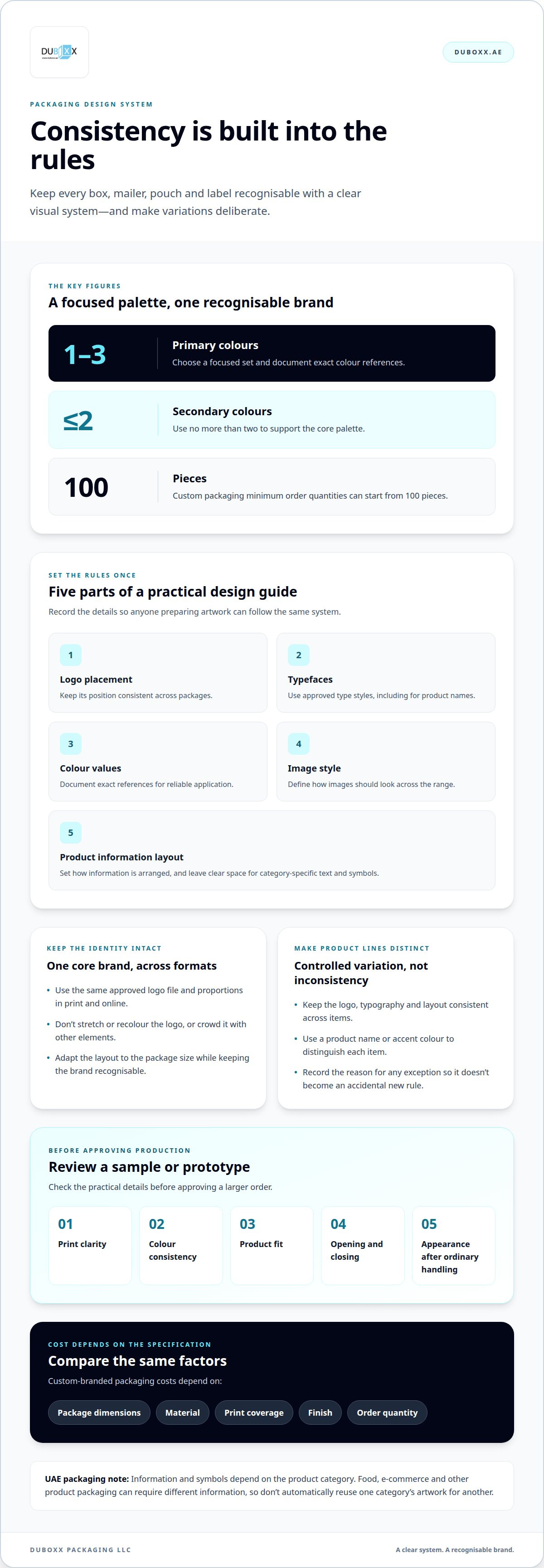
Consistency helps customers recognise your business on a box, mailer, pouch or product label. Start with a simple packaging design system: define logo placement, typefaces, colour values, image style and the arrangement of product information. Record these rules in a short guide that anyone preparing artwork can follow. For example, specify that the logo sits in the same corner on each package and product names use one approved typeface.
Apply the same core identity across customer touchpoints, not just packaging. A customer might first see your product in an online listing, then receive it in an e-commerce parcel and later encounter it in a retail display. Use matching logo artwork, brand colours and naming throughout. Details can adapt to package size, but the brand should remain recognisable. Create a compact, readable layout for a pouch and a more spacious version for a shipping box.
Product lines also benefit from shared design rules. Keep the logo, typography and layout consistent across items, then make controlled changes, such as a product name or accent colour, to distinguish each one. A skincare range, for instance, can use one visual structure while assigning a different accent to each formula. This connects the range without making every package look identical.
Set logo rules before approving artwork. Use the same approved file and proportions across print and online channels. Don’t stretch or recolour the logo, or crowd it with other elements. Check that it remains clear at the smallest size used on a pouch and visible from a distance on a larger box. A flexible design can include a compact logo version, as long as its shape and core colours remain consistent.
As a practical starting point, choose one to three primary colours and no more than two secondary colours. Document exact colour references, type styles, spacing, image treatment and the clear space required around the logo. Apply the guide to every product line and package format. If a design needs an exception, record why so it doesn’t become an accidental new rule.
In the UAE, packaging information and symbols depend on the product category; there isn’t one universal checklist for every package. Let category-specific labelling needs shape the layout, and reserve clear space for relevant text and symbols rather than adding them at the last minute. Food, e-commerce and other product packaging can require different information, so don’t automatically reuse one category’s artwork for another.
Custom-branded packaging costs depend on factors such as package dimensions, material, print coverage, finish and order quantity. Custom packaging minimum order quantities can start from 100 pieces. Before a larger order, assess a sample or prototype for print clarity, colour consistency, fit, opening and closing, and how it looks after ordinary handling. Ask a few customers to use it and share feedback, then refine the artwork or structure before approving production.
2. Choosing brand colors that reflect the company’s personality
Colour should express your brand identity and help your intended audience understand what your product stands for. Begin by naming three traits, such as calm, energetic or refined, then choose colours that support them. A natural skincare brand might use muted greens and warm neutrals, while a playful snack brand could use brighter tones. Treat these as design choices, not fixed rules about what a colour must mean.
Check the palette under real packaging conditions. Colours can look different on screen and in print, and a small label has less room for subtle contrast than a broad box panel. Review a printed sample in bright and softer lighting. Make sure the brand name and key message remain easy to read against the background. Choose typography that matches the same personality, such as a clean, simple font for a modern identity.
Materials should suit the product as well as the visual concept. Moisture, temperature changes and contamination can affect material, coating and adhesive choices. A food package, for example, must suit how the product is handled and stored, while an e-commerce parcel should arrive looking presentable after transit. Choose materials and finishes that meet practical needs while reflecting your brand’s ethos.
Your audience and business goals also shape the decision. A premium gift may call for a carefully finished presentation, while a frequently shipped everyday item may need a practical format that keeps its branding clear. For a growing product range, use shared colours and typography while giving each product a distinct accent. This helps customers recognise the range and distinguish its items.
To compare packaging suppliers in the UAE, assess samples against the same brief: material, dimensions, print appearance, finish and intended use. Compare how clearly each sample reproduces your artwork and how well its construction suits the product. A written specification makes differences easier to judge than a design image alone, and helps keep expectations consistent from sample review to production.
Sustainable packaging choices can include paper-based formats and designs that avoid unnecessary material, when these suit the product’s protection needs. Cost depends on package size, material, printing, finish and order quantity, so compare options using the same specification rather than appearance alone. A simpler design can reduce visual clutter while keeping the brand recognisable.
For a practical next step, prepare a short brief with your audience, product needs, preferred colours and material priorities. Explore packaging choices that can bring those decisions together in a polished, consistent presentation.
3. Avoiding mixed messages and copying competitors
A package sends a message before customers read its details. Make sure its colours, wording and images support the same promise. For example, a minimalist design crowded with promotional copy can feel inconsistent. Choose the main impression you want customers to take away, such as practical, premium or playful. Then assess each visible element against that intention.
Keep the product promise clear and specific. If your business sells handmade soap, packaging that highlights its ingredients and careful production tells a coherent story. Unrelated claims on the same package can make it harder for customers to understand what distinguishes the product. Give the product name and primary benefit the strongest visual priority, then use supporting text for useful details.
Other packaging in your category can help you understand conventions, but copying distinctive features weakens your own identity. Rather than reproducing another brand’s layout, colour arrangement or wording, note what information customers need to find and present it your way. For instance, make product instructions easy to spot while using your own typography, imagery and tone.
Separate inspiration from imitation by recording the design decision behind each reference. Another package’s clear front-panel hierarchy may offer a useful lesson, while its signature illustration should remain its own. Translate the general principle into a different execution, such as placing your product benefit beside your brand mark. This keeps your package useful without making it look borrowed.
Mixed messages can also come from promises that the package and product experience don’t support. A refined presentation paired with unclear directions may disappoint customers after purchase. A bold sustainability message should match the materials and choices behind the package. Keep claims precise, and ensure the design doesn’t imply product features your business doesn’t provide.
Names need consistency, too. Frequent yearly changes to a brand name can confuse customers, especially when packaging, online listings and existing stock show different versions. Keep the approved name consistent across those touchpoints. If a genuine rebrand is needed, plan how the new name and visual identity will appear together during the transition.
Before approving artwork, compare the package with your product page, social posts and customer-facing messages. Check the brand name, product description, tone and main promise. For example, if an online listing describes a gift-ready product, the delivered package should meet that expectation. A brief review of these touchpoints can reveal conflicting wording or design choices before they reach customers.
Ask someone unfamiliar with the design to describe the product, audience and main benefit after a brief look. If their interpretation differs from your intended message, simplify the hierarchy or remove distracting copy. This practical check helps you refine packaging around your own position rather than imitate another brand’s appearance.
4. Common branding and production mistakes
Small inconsistencies can make a package look unfinished, even when the design is attractive. A logo with different proportions on a pouch and box, for example, weakens recognition. Keep approved artwork in one shared location and use the same master file for each format. Before production, compare the final proof with that file.
Changing a brand name frequently can confuse customers. They might see one name in an online listing and another on the delivered package. Keep the approved name consistent across packaging and customer-facing channels. If a name change is necessary, plan the transition so existing stock, new artwork and online information don’t send conflicting signals.
Artwork errors can become costly once production begins. Check spelling, product names, image placement and colour consistency on the final proof. Production quality checks can include reviews of approved artwork, colour consistency and barcodes before production starts. Treat each as a separate check, since a correct design file can still contain an overlooked error.
Labels may not sit smoothly on an irregular container surface. A crease, lifted edge or wrinkle can affect appearance and readability. Review the actual package shape alongside the label design, especially around curves, corners and textured areas. A flat digital mock-up may not show how the label behaves on the finished container.
Another common mistake is choosing a finish before considering how the package will be handled. A glossy surface can show marks more clearly than a textured one, while delicate details may disappear on a busy background. Compare samples under the lighting in which customers will encounter them, such as on a shop shelf or during a parcel opening.
Last-minute edits create avoidable production risks. A changed product name or repositioned logo can affect spacing, legibility and barcode placement. Keep one final approved artwork version, label it clearly and remove outdated files from the production handoff. For a product range, review every variation against the same master layout before releasing files.
A practical review can fit into a 30-day improvement plan. During the first week, gather visible brand materials and assess their consistency. Use the second week to clarify the message, then improve high-visibility materials during the third. In the fourth week, track customer response and compare enquiries before and after those changes.
Finally, use customer feedback to spot problems an internal review might miss. Ask whether the package was easy to open, the product information was clear and the brand felt recognisable. Record recurring comments, then decide which artwork or production detail to adjust before the next run.
5. Visual elements that make packaging look professional
A polished package guides the eye in a deliberate order. Give the brand name clear prominence, then make the product name and main benefit easy to find. For example, a tea box could lead with its brand, followed by the blend name and a concise flavour description. If every element competes for attention, customers may miss what distinguishes the product.
Typography shapes readability and character. Choose typefaces that suit the product, then use size and weight to distinguish headings from supporting information. A refined skincare label might pair a restrained headline with highly legible directions. Don’t shrink essential copy to fit decorative wording. Review the design at its actual printed size, especially on narrow pouches and small product labels.
Spacing is a design element, not wasted space. Leave room around the logo, product name and key message so each stands out. A crowded front panel can be harder to scan than a layout with fewer, better-placed details. Try removing a decorative element, then check whether the product information is easier to notice.
Images and illustrations should clarify the product or express its character. A line drawing of a plant can suit a botanical product, while unrelated stock imagery may confuse customers. Use a consistent image treatment across a product range, such as simple illustrations or close-up product photography. Check that the image stays sharp and balanced across the package’s curved or folded areas.
Material and finish affect how a design is perceived. A matte surface can create a restrained look, while gloss draws attention through reflection. Choose based on the product and brand position, not a trend alone. Then assess a physical sample under the lighting where customers will see it, such as on a retail shelf or during delivery unboxing.
Small finishing details often distinguish a considered design from a generic one. Align text with panel edges, balance margins and make sure folds don’t interrupt important words. On a box, inspect how the front panel connects with the sides and opening flap. On a mailer, check that key branding remains visible when the package is held naturally.
Use a simple visual review before approving artwork: view the package from a distance, inspect it close up and check it at actual size. Ask someone unfamiliar with the product what they notice first and what they understand it contains. If their answers differ from your intended message, adjust the hierarchy before production.
Turn these visual choices into a cohesive package with customise your packaging design.
A brand name can strongly influence a company’s branding and product packaging, so choose wording that fits the visual identity and product.
Duboxx Packaging: Custom Branded Packaging
Duboxx Packaging LLC helps businesses turn established visual guidelines into custom packaging for a consistent customer experience. Its options include e-commerce packaging, shipping and moving boxes, and food packaging. For a growing brand, this can carry a recognisable identity from product presentation through to delivery.
Custom packaging minimum order quantities start from 100 pieces, making it a practical option for startups and SMEs as well as established brands. Bring your approved logo, artwork, preferred colours and packaging requirements together to guide the project. Thoughtful material and design choices can help balance brand presentation with the package’s intended use.
Contact Duboxx Packaging LLC to discuss custom branded packaging for your business.
Turn your packaging direction into a clear next step
Your next packaging decision can be a focused one: choose a product or customer moment where a more polished presentation would make the biggest difference. If you're considering how to make your brand look professional with packaging, start with one format and carry your visual direction through its design and production details. This gives you a practical way to refine the experience as your business grows.
For a business in the UAE, the right format depends on what you’re packaging and how customers receive it. Duboxx Packaging offers e-commerce packaging, shipping and moving boxes, food packaging and custom branded packaging. These options help translate a considered brand identity into packaging suited to different business needs.
As you decide how to make your brand look professional with packaging, bring your goals and design direction into the conversation, then take the next step at a pace that suits your business. Discuss your packaging with Duboxx Packaging and move your brand presentation forward with confidence.
Frequently Asked Questions
What packaging design elements make a brand look professional?
A professional package makes the product and brand easy to identify at a glance. Consider how the front, sides and opening area work together, not just the main panel. For example, a customer opening a subscription box might find a brief welcome message inside, while the outer design stays uncluttered. Keep decorative details purposeful, and make sure they don’t compete with the product name or make the package harder to use.
What packaging materials and finishes look premium but are affordable?
Simple material choices can create a refined look without elaborate finishes. A clean paperboard structure with restrained printing, carefully aligned artwork and one distinctive detail can feel considered. For instance, use a contrasting inside panel or a small printed accent instead of covering every surface. The best choice depends on how the package must protect the product, how it will be handled and the presentation your audience expects.
How do I design packaging that protects products and looks professional?
Start with the product’s shape, fragility and likely movement inside the package. Choose a structure that holds it securely, then add suitable cushioning or dividers where needed. For a glass item, separate it from other contents so the pieces don’t knock together during handling. Keep protective elements neat and easy to remove, and place branding where folds, closures or inserts won’t hide it once the package is assembled.